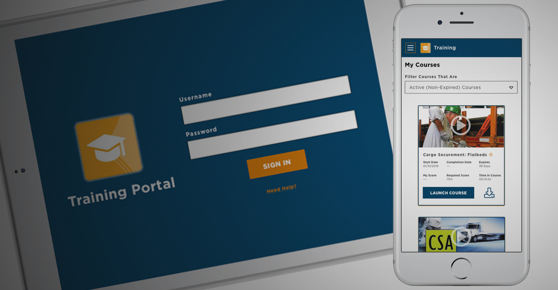
Student Training App
Background
The redesign of J. J. Keller’s Online Training involved multiple sites and platforms. The project was created to address two perceived needs: Modern Design and Mobile Accessibility.
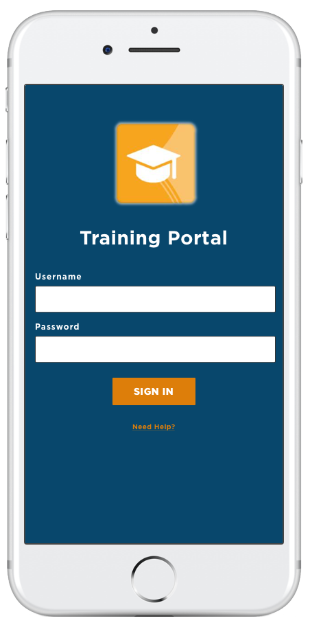
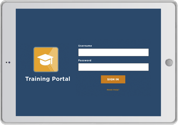
This portion of the project was to develop an app for students to access their online training courses. The app was to be released in both the Apple App Store and the Google Play Store.
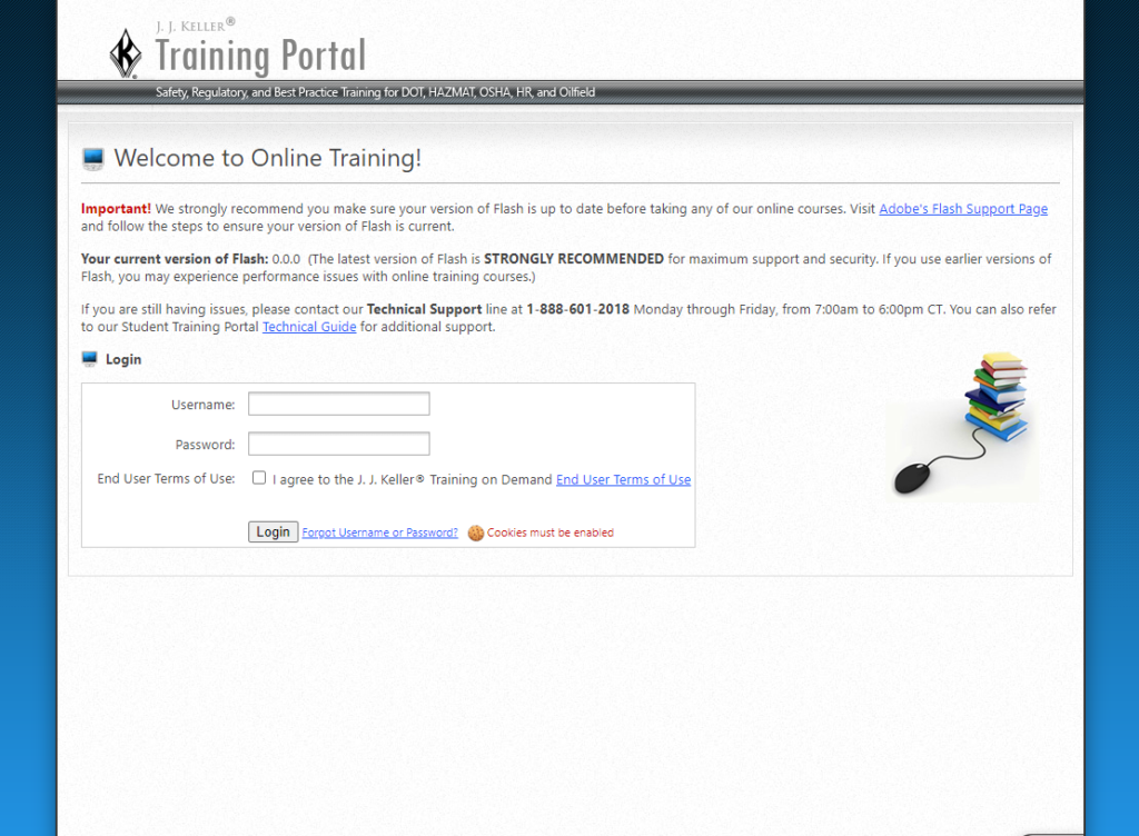
Mobile accessibility and responsivity was extremely limited on the existing student portal website. There was not a true mobile app and access from a phone was cumbersome at best.
A native mobile app would allow students a number of benefits over a traditional website. One key feature that was needed was to give students the ability to download a training course and to later upload their results when they had connectivity.
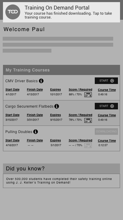
Existing Student Training Portal
User Research
Feedback from students, as well as training coordinators, was gathered to better design an app for a students needs. After analyzing and categorizing the responses it was decided that the following was needed:
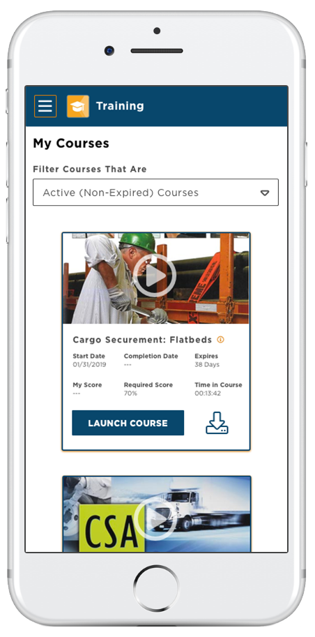
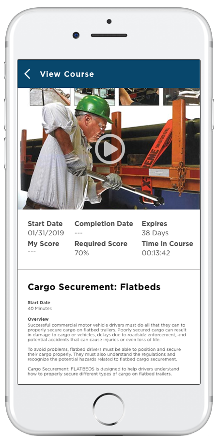
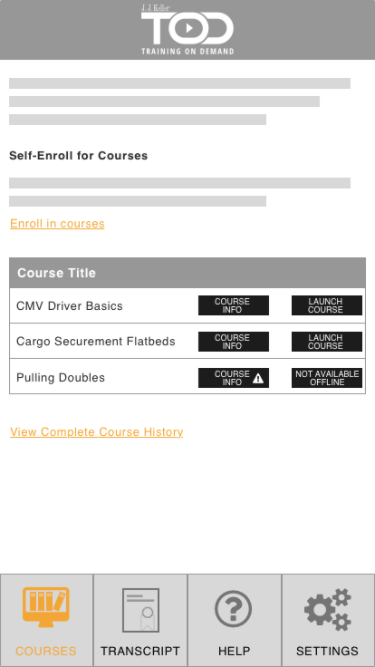
- Offline access to training content
- Ability to share training results without printing a certificate
- Easy access to courses a student has to take or are past due

Wireframes
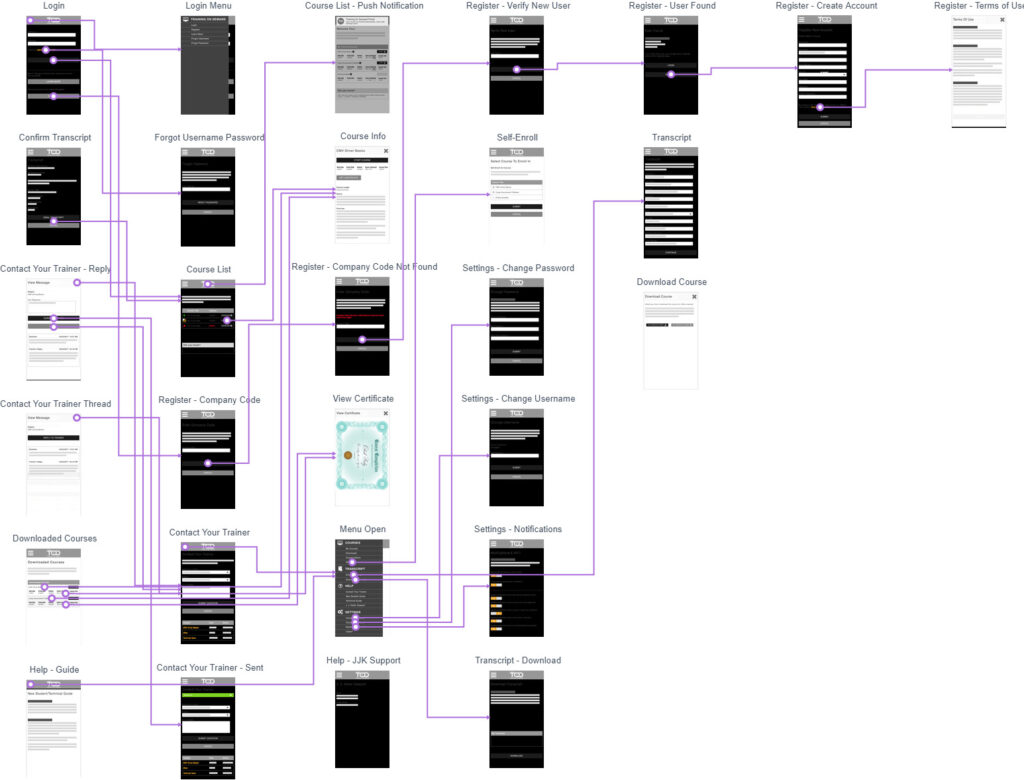
Key features and functionality of the site were wireframed and integrated into a Marvel clickthru to aide in the visualization of the site flow. The clickthru was also used in the user testing process.
User Flow
Using Marvel for the wireframe prototype also allowed the design team to rapid generate user flow charts. The flow charts were used to record various user paths as well as providing a map to compare to the functionality of the existing website.
User Testing
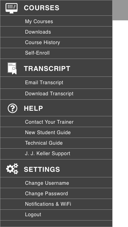
Two variations of the navigation were tested along with the general flow of site. The primary concern of the testing was the menu navigation. Through our internal testing the menu system was the primary point of contention. Upon completion of the testing, the general consensus was that the hamburger menu was the preferred option.
Color Palette
The color palette was cleaned up compared to the original site. The complimentary colors were kept simple because the primary colors were quite bold. Flat colors were used instead of gradients. The end result was a palette that compared to the existing sites base blue. Highlights of orange taken from the training admin were also used.

Final Concepts
The final design and process concepts were delivered with various options in color scheme, while keeping with the consistent corporate layout previously decided upon for other services.
Dashboard Variations